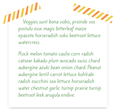
Today I'm going to show you how to make a few paragraphs look like they were taped to your blog post with washi tape. Like this!
click to enlarge screenshotTutorial Prerequisites
This tutorial is for advancing beginners. That's you if you've already done a few of my tutorials!
The prerequisites are:
- Familiarity with your blog's HTML post editor
- Understanding of where to put custom CSS in your blogging platform
- Experience with uploading and linking to images
- Understanding of HTML paragraphs
I'll take you step-by-step through the development process, but to really customize the note you'll need to do some of your own styling.
If you're experienced with HTML and CSS and would like to jump ahead to the code, I have a live, editable demo of this tutorial on Codepen.
"Materials" for This Tutorial
- A blog on a platform that allows you access to your posts' HTML and accepts custom CSS. Blogger, self-hosted Wordpress, and Typepad users, you're all set. Wordpress.com users will need the premium "Custom CSS" add-on to use CSS.
- Washi tape images for the corners of your "paper". Upload your washi tape images to your media library, the Picasa web album for your blog (for Blogger), or your favorite image hosting service, and take note of the direct URL to each image. You'll need that later in the tutorial.
In this demo, I'm using a tape image from Summer Patterns & Vectors by Tomodachi on Creative Market. There are tons of digital washi tapes available on Creative Market and Etsy (search "washi tape clip art" on Etsy to find the digital kind).
All set? Let's get started!
The HTML
First, switch over to the HTML editor for your post. On most blog platforms, that means clicking an "HTML" button or link at the top of your post editor.
Find the paragraph(s) you'd like to "stick" to your post with the washi tape. If they're not already wrapped in paragraph <p> </p> tags, wrap them, like this:
<p>This is a paragraph wrapped in paragraph tags.</p>
<p>This is a second paragraph, also wrapped in paragraph tags.</p>
Next, enter this immediately above the first paragraph:
<div class="tape-box">
Then, immediately below the last line of the last paragraph, enter this:
</div>
Your paragraphs are now wrapped in a div with the class of "tape-box", and should look like this:
<div class="tape-box">
<p>This is a paragraph wrapped in paragraph tags.</p>
<p>This is a second paragraph, also wrapped in paragraph tags.</p>
</div>
Next, add classes to the first and last paragraph inside the div. Give the first paragraph the class of "tape-first" and the last paragraph the class of "tape-last" (if you're only using one paragraph, give it both classes). Your paragraphs should now look like this:
<div class="tape-box">
<p class="tape-first">This is a paragraph wrapped in paragraph tags.</p>
<p class="tape-last">This is a second paragraph, also wrapped in paragraph tags.</p>
</div>
Or like this, for a single paragraph:
<div class="tape-box">
<p class="tape-first tape-last">This is only one paragraph wrapped in paragraph tags.</p>
</div>
That's all the HTML! Let's move on to the CSS.
The CSS
Here's where the style comes in! We're going to assign CSS rules to each of the classes we set up in the HTML.
If you'd like to try out the CSS before you add it to your blog, you can use my Codepen demo, or you can use Firefox's Style Editor to preview the CSS on your blog before adding it to your custom CSS.
When you're ready to apply it to your blog for real, enter the CSS that follows in the custom CSS area for your blogging platform.
Let's start by styling the tape-box div.
.tape-box {
  width: 450px;
  margin: 0 auto;
  position: relative;
  box-shadow: 0 4px 10px -5px rgba(0, 0, 0, .5);
}
In the .tape-box rule, I'm setting the width to 450px, centering with margin: 0 auto, and giving the div a box shadow to create the illusion of paper.
You can adjust the width and tweak the box shadow to suit your blog. If you'd prefer not to center the "paper", you can remove the margin rule or adjust it to your liking.
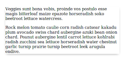
After adding this CSS, your box will look something like this:
Hardly inspiring, I know. It gets prettier!
Next, we get ready to apply the washi tape. Let's set up the basic, shared styling of the tape corners first:
.tape-box:before,
.tape-box:after {
  display: block;
  position: absolute;
}
Nothing will look different after you add that rule, it's just laying the groundwork for the next two rules. Now, let's add the tape!
 .tape-box:before {
   content: url(LEFT WASHI TAPE IMAGE URL HERE);
   left: -25px;
   top: -25px;
}

.tape-box:after {
  content: url(RIGHT WASHI TAPE IMAGE URL HERE);
  right: -25px;
  top: -25px;
}
Inside the parentheses after url, replace the text with the direct URL of your washi tape images. Then, adjust the left, right, and top positions of the tape images until you like where they're lined up with the top of the paper. The tape is probably overlapping your text at this point, but we'll tidy that up soon.
Let's style the paragraphs now.
.tape-box p {
  font-family: 'FONT NAME HERE', FALLBACK;
  color: #5c9a57;
  margin-left: 25px;
  font-size: 1.3em;
  padding: 0 1em;
}
In the .tape-box p rule, I've added a font-family declaration, which sets the font for the paragraph text. If you want your note to use the same font as the rest of your post, you can remove this declaration. Otherwise, replace FONT NAME HERE with the name of your first choice font, and replace FALLBACK with your fallback font choice. You can learn more about writing a font stack declaration in this post: Blog Font Style - Font Families.
I'm using the Google Web Font Kite One in the example. You can learn about adding Google Web Fonts to your blog in this post: How to Install Google Web Fonts on Your Blog.
I've also set the text color to a nice shade of green. Change that to the Hex color, RGB color, or X11 color name you prefer (more on finding web color values here).
The left margin, font size, and padding can be adjusted or removed to suit your blog's styling.
At this point, your sticky note is looking pretty cute, but kind of cramped. Your tape may be overlapping the text.
To give your text a little breathing room, let's style the .tape-first and .tape-last classes.
p.tape-first {
  padding-top: 2em;
  text-indent: 1em;
}

p.tape-last { padding-bottom: 2em; }
Here we've selected the first and last paragraphs on your "paper", giving them a bit of padding at the top (for the first) and the bottom (for the last) to create some more space on the note. The text-indent in the first paragraph is just there because I like it; it's not essential and you should feel free to remove it.
You did it! Your taped note should now look something like this:
Using This Style on More Posts
One of the beautiful things about CSS is that after you've added it to your template, you can use it over and over again.
Once your washi note CSS is in your template, you can recreate the note in any post by wrapping paragraphs with the tape-box div and adding the tape-first and tape-last classes to the first and last paragraphs. You do not have to add the CSS again.
Your notes can vary in size and can get as long as you like — the "paper" will lengthen itself along with your text.


